


Design · · 7 min read
CSS anchor positioning: tooltips and menus that follow their trigger
Anchor positioning works in Chrome, Safari and Firefox. The properties you need, the flip-when-it-does-not-fit rule, and the repeated-name bug.
Pinning a tooltip, dropdown or popover to the button that opened it no longer needs a positioning library. CSS can do it, in all three engines:
.trigger { anchor-name: --trigger; }

.tooltip {
  position: absolute;
  position-anchor: --trigger;
  position-area: block-start center;
  margin-block-end: 8px;
}
That is the whole thing: name the anchor, point the positioned element at the name, say where to sit relative to it. Firefox 147 was the last engine to ship the core of the feature, on 13 January 2026.
This covers the properties that do the work, how to make an element flip when it would overflow the screen, and the one bug almost everybody hits the first time.
Name the anchor, then point at it
anchor-name marks an element as an anchor. The value is a dashed ident, and an element can carry several names.
.card { anchor-name: --card, --card-menu; }position-anchor names the anchor a positioned element should use. It applies to absolutely positioned boxes, so the positioned element needs position: absolute or position: fixed.
What gets measured is the anchor's border box. The spec includes zoom, position: relative and position: sticky offsets and transforms in that measurement — for transforms it uses the axis-aligned bounding rectangle. Filters do not move the anchor box.
position-area: the nine-cell grid
position-area is the easy way to place the element. It treats the anchor as the centre cell of a 3×3 grid and puts the positioned element in the region you name.
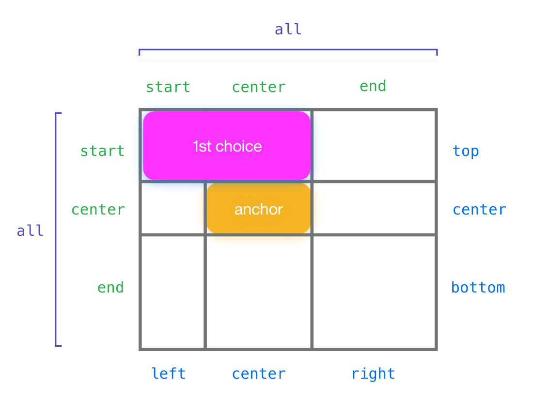
.tooltip { position-area: block-start center; }  /* above, centred */
.menu    { position-area: block-end span-inline-end; }  /* below, growing right */
You can use physical keywords (top, bottom, left, right), logical ones (block-start, inline-end) or self-relative ones (self-inline-start). Logical keywords follow the writing mode, which is what you want for anything that gets translated into Arabic or Hebrew.
For finer control, anchor() returns a single edge of the anchor and anchor-size() returns one of its dimensions:
.menu {
  position: absolute;
  position-anchor: --trigger;
  top: anchor(bottom);
  left: anchor(left);
  min-width: anchor-size(width);
}
Use position-area for the common cases and anchor() when you need the element to line up with a specific edge or match the trigger's width.
Flipping when it will not fit
A menu pinned below its button has to move when the button is near the bottom of the viewport. @position-try defines an alternative placement; position-try-fallbacks lists the placements to try in order.
@position-try --above {
  position-area: block-start center;
  margin: 0 0 8px 0;
}

.menu {
  position-area: block-end center;
  margin: 8px 0 0 0;
  position-try-fallbacks: --above;
}
The browser lays the element out with its normal styles first. If it overflows, it tries each fallback in turn and uses the first that fits; if none fits, it uses the original.
@position-try deliberately accepts only six groups of properties: inset properties, margin properties, sizing properties, self-alignment properties, position-anchor and position-area. A fallback can move and resize the box; it cannot restyle it. If your flipped tooltip needs a different arrow or corner radius, that has to come from somewhere else.
For simple flips you do not need a named rule at all. The <try-tactic> keywords transform the current position for you:
| Keyword | What it does |
|---|---|
flip-block | Mirrors the placement across the block axis |
flip-inline | Mirrors it across the inline axis |
flip-start | Swaps the block and inline axes |
flip-x, flip-y | Mirrors across the physical axes |
.menu { position-try-fallbacks: flip-block, flip-inline, flip-block flip-inline; }flip-block, flip-inline and flip-start have been in all three engines the longest. flip-x and flip-y are newer — Safari 26.2 in December 2025, Chrome 144 in January 2026 — so if you support older Chrome versions, prefer the logical three.
You can also list a bare position-area as a fallback, which is often the clearest form:
.menu { position-try-fallbacks: block-start center, inline-end center; }The repeated-name bug
This is the one that catches people. Anchor names do not have to be unique. If you write a component and give every instance the same anchor name, every tooltip on the page can end up pointing at the same element.
The spec's rule: when several elements share a name and are all visible to a positioned box, the target is the nearest ancestor with that name if one exists, and otherwise the last one in DOM order. So a tooltip nested inside its own card behaves correctly by accident, and a tooltip that is a sibling of the card — or rendered in a popover at the end of the body — silently snaps to the last card on the page.
Anchor names are not scoped by containment either. contain: style or contain: layout on a component does not hide its anchor names from the rest of the document.
The fix is anchor-scope, which limits both the names and the lookups to an element's subtree:
.card {
  anchor-scope: --card;   /* or: anchor-scope: all */
}
.card .trigger { anchor-name: --card; }
anchor-scope: all scopes every name defined inside the element, which is usually what a component wants. It has been in Chrome since 131, Safari 26 and Firefox 147.
One limit worth knowing: anchor-scope has no effect on implicit anchor elements — the ones the host language defines rather than CSS.
Hiding the element when the anchor scrolls away
If the anchor scrolls out of a scroll container, a fixed tooltip will otherwise sit there pointing at nothing. position-visibility handles it:
.tooltip { position-visibility: anchors-visible; }no-overflow hides the element when it would overflow its containing block instead. always opts out of both.
The keyword names are in flux. anchors-visible is what ships in Chrome, Safari and Firefox today. The editor's draft has renamed it to anchor-visible and made it the initial value, and at the time of writing only Safari 27 beta implements the new spelling. Use anchors-visible for now and expect to revisit it.
Browser support
Versions from MDN's browser-compat-data at the time of writing.
| Piece | Chrome | Safari | Firefox |
|---|---|---|---|
anchor-name, anchor(), anchor-size(), @position-try | 125 | 26 | 147 |
position-try-fallbacks | 128 | 26 | 147 |
position-area | 129 | 26 | 147 |
anchor-scope | 131 | 26 | 147 |
flip-x, flip-y tactics | 144 | 26.2 | 147 |
position-visibility: anchors-visible, no-overflow | 125 | 26.2 | 147 |
Every row in that table has been available in all three engines since 13 January 2026, the day Chrome 144 and Firefox 147 both shipped.
Two things are still uneven and worth avoiding: the anchor-valid and anchor-visible keywords (Safari 27 beta only), and relying on the initial value of position-anchor. All three engines shipped that property with a non-standard initial value and have been correcting it at different times, so always write the anchor name explicitly rather than depending on an implicit default.
No @supports guard is needed for progressive enhancement: a browser that does not understand position-area ignores it, so give the element a sensible static position first and let anchor positioning improve it.
What still needs JavaScript
- Arrow or caret positioning that has to track the anchor's centre when the box has flipped. You can get a long way with
position-areaon a pseudo-element anchored to the same name, but reading which fallback won still needs script. - Opening and closing. Anchor positioning only positions. Use the popover attribute or a
<dialog>for the show/hide behaviour — see the dialog you can open, close and style without JavaScript. - Anchors that move via transform. The spec notes that transforms are often handled on another thread, so transform-driven anchor movement "may be delayed by a few frames", and suggests absolute or relative positioning instead where practical. If you animate an anchor with
transform, expect the tooltip to lag slightly.
FAQ
Can I drop Floating UI or Popper?
For anchoring a box to a trigger with flipping and a couple of fallbacks, yes, in browsers that support it. Keep the library if you need collision detection against arbitrary boundaries, arrow positioning that reacts to the chosen placement, or support for browsers older than the versions in the table above.
Does the anchor have to be an ancestor or sibling?
No. Any element with a matching, in-scope anchor name works, anywhere in the document. That is what makes the repeated-name behaviour surprising — there is no structural relationship enforcing which one you get.
Does it work across shadow DOM?
Partly. The spec allows a positioned element in a shadow tree to reference anchor names defined in higher trees, but not names defined in lower shadow trees. A page-level tooltip cannot anchor to something inside a component's shadow root.
What happens if the anchor is display: none?
It stops being a usable anchor. The spec also calls out content-visibility: hidden: while an element is in another element's skipped contents it behaves as if it had no anchor names at all.
Sources
- CSS Anchor Positioning Module Level 1 — the W3C CSS Working Group editor's draft, read from its source in the csswg-drafts repository
- mdn/browser-compat-data — support versions and browser release dates for
css.properties.anchor-name,position-anchor,position-area,position-try-fallbacks,position-visibilityandanchor-scope - web-platform-dx/web-features — Baseline status for the anchor positioning feature
More to read
- Design
Design · · 6 min read
@scope is Baseline: scoped CSS without the class-name gymnastics
@scope became Baseline newly available in March 2026. The donut, where scope proximity really sits in the cascade, and why it is not nesting.
- Tech
Tech · · 6 min read
Highlighting text without touching the DOM: the Custom Highlight API
Style arbitrary text ranges with CSS and no wrapper elements. The short list of properties that apply, live versus static ranges, and the overlap rules.