


Design · · 6 min read
Masonry finally shipped in CSS. It is called grid lanes
Safari ships display: grid-lanes, the CSS Working Group's answer to masonry. The syntax, the flow-tolerance property, and the reading-order trap.
The Pinterest-style layout — columns of uneven cards, each new card dropped into the shortest column — is now a CSS layout mode. It is not called masonry:
.gallery {
  display: grid;
  display: grid-lanes;
  grid-template-columns: repeat(auto-fill, minmax(240px, 1fr));
  gap: 1rem;
}
That is the whole layout. No measuring, no absolute positioning, no library.
The catch is support. At the time of writing, display: grid-lanes ships in Safari 26.4 and later, including on iOS, and in no other engine: MDN's browser compatibility data records false for Chrome and Firefox. So this is a progressive enhancement today, not a replacement for your JavaScript masonry.
This article covers what the spec defines, the one property you have never heard of, and the accessibility problem the spec itself warns about.
Why it isn't called masonry
If your searches keep returning display: masonry, that is the old name. The proposal has been renamed more than once on its way through the CSS Working Group, and the current names come from CSS Grid Layout Module Level 3.
| You may have read | Current name |
|---|---|
display: masonry | display: grid-lanes (and inline-grid-lanes) |
item-tolerance | flow-tolerance |
the item-* family of flow properties | dropped |
The spec's own change log records the rename of item-tolerance to flow-tolerance, and the dropping of "the item-* proposal for unified flow controls across layout modes". Level 3 lists its additions since Level 2 as grid lanes layout, the flow-tolerance property, and an expansion of repeat(auto-fill) and repeat(auto-fit) to accept indefinite track sizing functions.
The spec's term for the layout is worth knowing, because it explains the behaviour. A grid lanes container lays items out "into pre-defined tracks similar to grid layout in one axis (called the grid axis), but flows them freely similar to flex layout in the other (called the stacking axis)".
Columns or rows: the template decides
There is no direction property to set. The orientation comes from which template you declare:
- Set
grid-template-columnsand you get a waterfall that grows downward. - Set only
grid-template-rows(leavinggrid-template-columns: none) and you get a brick wall that grows sideways.
/* Waterfall */
.a { display: grid-lanes; grid-template-columns: 100px 200px; }

/* Brick wall */
.b { display: grid-lanes; grid-template-rows: 100px 200px; }
In the grid axis you keep the full power of grid: track sizes, line names, areas, and grid-column / grid-row placement all work as they do in a normal grid container. Subgrid works too, but only in the grid axis. In the stacking axis there is no grid — which is why absolutely positioned children only get two lines to work with there, the start and end edges of the stacking range.
The spec still carries an open issue about whether grid-auto-flow is the right property for this or whether a separate grid-lanes-direction should be defined, so treat the orientation mechanism as the least settled part.
flow-tolerance, the property nobody mentions
Items go into whichever track is least filled. That rule alone produces a layout that reads badly: two columns differing by three pixels are not perceived as different, but the algorithm still picks the shorter one, so items appear to jump backwards.
flow-tolerance sets the threshold at which two tracks count as the same height:
.gallery {
  display: grid-lanes;
  flow-tolerance: 2em;   /* normal | <length-percentage> | infinite */
}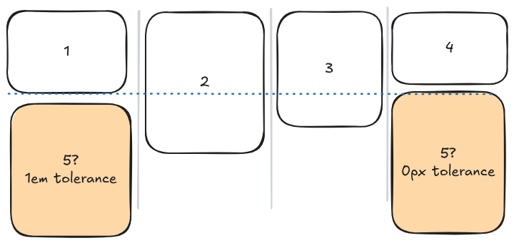
The initial value is normal, which resolves to 1em in grid lanes layout and 0 everywhere else. Percentages are relative to the grid-axis content box of the container. It is not inherited, and it animates as a length.
infinite makes items fill strictly in source order, ignoring track lengths entirely. The spec discourages reaching for it: it "can result in consecutive items being placed in dramatically different positions in the stacking axis, which can be confusing to readers", and suggests that if 1em is too small you try a larger length such as 10em or 50vh instead.
A practical starting point: leave it alone for image galleries where the cards are all roughly one shape, and raise it to a couple of em for text cards, where small height differences are invisible but out-of-order placement is not.
The reading-order trap
This is the part that most write-ups skip, and it is the reason to design the layout rather than just switch it on.
Auto-placement generally moves forwards, but mixing spanning items or explicitly placed items with auto-placed ones makes it backtrack. The spec's own example: seven items in a five-column container, where item 4 spans three columns and does not fit in the space left on the first line. It drops to the first column — "the highest available space into which it will fit" — and the single-column items after it then lay out above it, "violating the natural reading order".
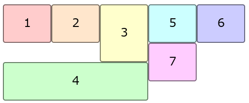
Tab order and screen-reader order follow the DOM, so a reader moving through the page visually and a reader moving through it by keyboard now disagree.
The spec's advice, in order of preference:
- Design so backtracking is minimal: avoid combining mixed span sizes in the grid axis with very different item sizes in the stacking axis, and use explicit placement to group related items rather than to disrupt their order.
- Tune
flow-toleranceto a value "large enough to avoid gratuitous differentiation among similarly-sized tracks, but not so large that meaningful differences get ignored". - If the items genuinely have no inherent order, use the
reading-flowproperty so the browser can re-order them for reading and linear navigation. See how reading-flow works for what it can and can't fix.
Shipping it now
The fallback is two declarations, and it is in the spec as the graceful-degradation example:
.gallery {
  display: grid;
  display: grid-lanes;  /* ignored where grid lanes is not supported */
  grid-template-columns: 150px 100px 50px;
}
An engine that has never heard of grid-lanes discards the second declaration and renders a plain grid with the same tracks. You get a tidier, gappier layout instead of a broken one — no @supports block needed, though @supports (display: grid-lanes) works if you want to change other properties at the same time.
For debugging, Safari's Web Inspector knows about the layout mode. The Safari 27 release notes record that it "added Subgrid and Grid-Lanes badges to the Elements tab for easier identification of subgrid and grid-lanes layout contexts".
The honest summary: use it as an enhancement on a design that already works as a grid, and keep your JavaScript masonry only if the gappy grid fallback is genuinely unacceptable. Browser support is time-sensitive — check it again before you rely on it.
FAQ
Is CSS grid lanes Baseline yet?
No. Baseline requires support in all core browsers, and at the time of writing only Safari ships it. Feature data marks masonry as not Baseline.
Can I keep using display: masonry?
The spec now defines grid-lanes and inline-grid-lanes as the inner display types that establish this layout, and MDN's compatibility data records no shipping support for a masonry value of display. Anything you read about display: masonry describes an earlier revision of the same proposal.
Does order work in a grid lanes container?
Yes. The spec says all CSS properties work the same as in a regular grid container unless stated otherwise, and gives order as the example. The usual caution applies: order changes layout order, not reading order.
What does grid-auto-flow: dense do here?
It allows the placement algorithm to backtrack into earlier empty slots, as it does in grid. Because placement and sizing are intertwined in grid lanes layout, an item only backtracks into a slot it actually fits, so the effect is smaller than in a normal grid.
Will Chrome and Firefox ship the same thing?
They are working from the same spec, but it is an Editor's Draft with open issues, including how the orientation is set. Write the fallback, and re-check support before removing it.
Sources
- CSS Grid Layout Module Level 3 — CSS Working Group, Editor's Draft
- Safari 27 release notes — Apple
- MDN browser compatibility data —
css/properties/display.json,css/properties/flow-tolerance.json - web-features — Baseline status for masonry
More to read
Design · · 5 min read
Bounce and spring easing in plain CSS, with linear()
linear() approximates any easing curve from a list of points, including ones cubic-bezier() cannot draw. The syntax, and the four rules that surprise people.
- AI
AI · · 7 min read
The browser has a language model, and almost no promises about it
The Prompt API puts a LanguageModel class in the page, with structured output, tool calls and a context window you manage. What it guarantees is the interesting part.