


Design · · 9 min read
Build a colour system from one brand colour, the way Material does it
Google publishes the exact recipe: five palettes from one seed, thirteen tones each, and a tone number for every role. You can run it by hand in an afternoon.
You have one brand colour and a product that needs forty. The usual answer is to hand-pick them, argue about the hover state, and discover six months later that nobody can say why the disabled text is that grey. There is a better answer, and Google publishes it as working code: derive five palettes from your one colour, generate thirteen tones of each, then assign a fixed tone number to every role in the interface.
The value is not the automation. It is that the decisions become numbers you can defend. Below is the recipe as the material-color-utilities repository actually implements it, read on 22 September 2026, with the real figures rather than a description of the idea.
First, stop thinking in HSL
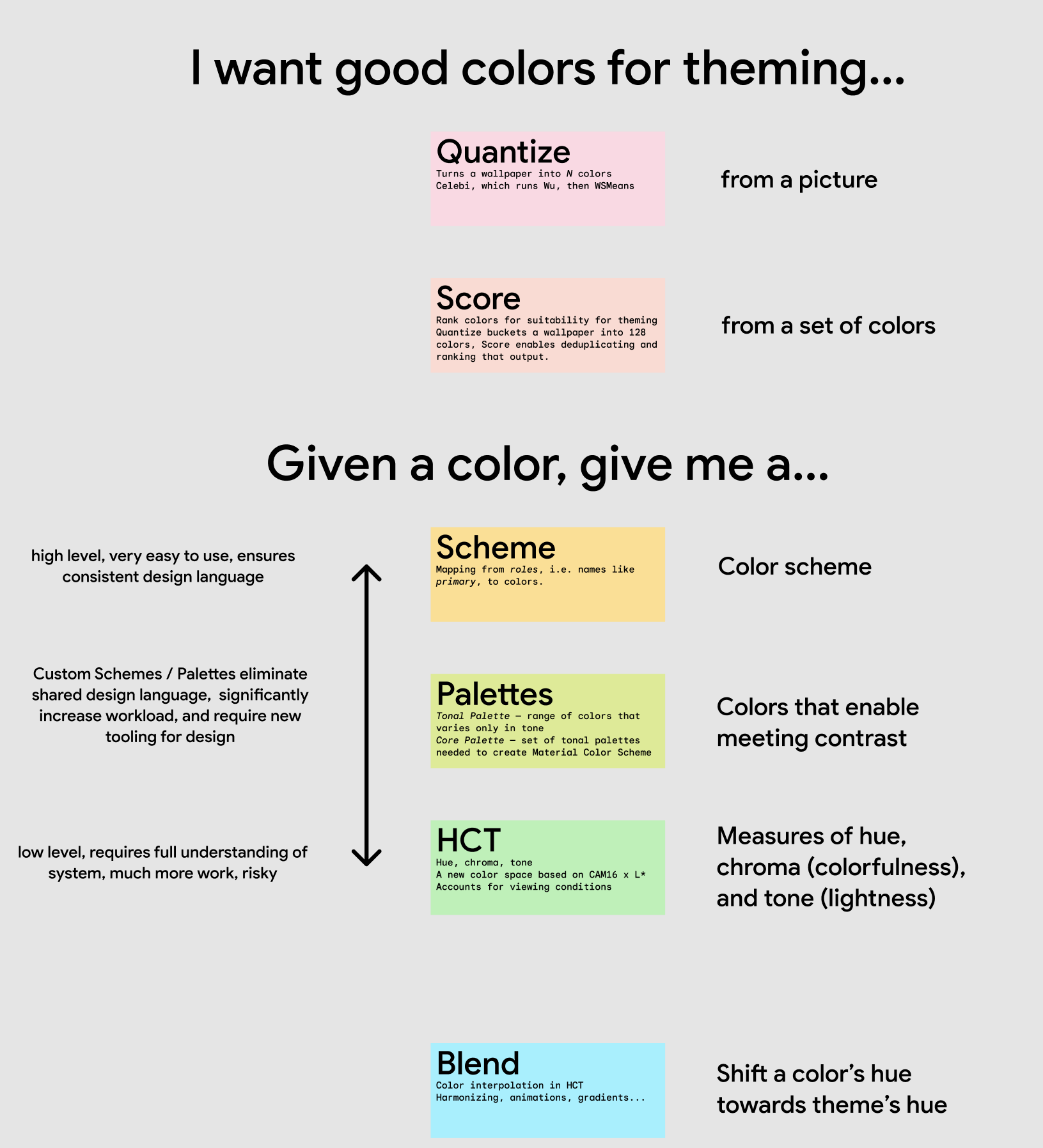
The whole system runs in a colour space called HCT, which the repository describes as "a new color space (hue, chroma, tone) based on CAM16 x L*, that accounts for viewing conditions". Three numbers:
- Hue, 0 to 360, circular, where 0 and 360 are the same
- Chroma, from 0, "completely gray", upward, and the docs note that "chroma values in HCT top out at roughly 120"
- Tone, 0 for pure black to 100 for pure white
The reason to care is the third one. In HSL, two colours with the same lightness value can have wildly different perceived brightness, which is why HSL palettes produce that familiar mess where the yellow looks blown out next to the blue at the same "50%". In HCT, tone is perceptual, and the documentation is explicit about the consequence: "For visual accessibility, tone is crucial because it determines control contrast. Colors with a greater difference in tone create higher contrast."
Once tone predicts contrast, a colour system becomes arithmetic.
github.com ↗Google's conceptual explanation of HCT, tonal palettes and dynamic colour schemesThe concepts document behind the definitions above, including the five key colours and thirteen tonesStep 1: pick the source colour and convert it
One colour. Your brand blue, or the colour extracted from a hero image. The docs call it the source colour, "a single color from which all other scheme colors are derived", and note that it can also be pulled out of an image through quantisation, which is what phone wallpaper theming does.
Convert it to HCT. Write down its hue and chroma; you are about to use both.
Step 2: derive five key colours
The system "systematically manipulates the source color's hue and chroma to create four additional visually complementary key colors". The exact manipulation depends on which scheme variant you choose. Tonal Spot is the one the developer guide reaches for first, and the code describes it as "the default Material You theme on Android 12 and 13". Its rules, in the library's default 2021 colour specification, are:
| Palette | Hue | Chroma |
|---|---|---|
| Primary | Your source hue | 36 |
| Secondary | Your source hue | 16 |
| Tertiary | Your source hue + 60 | 24 |
| Neutral | Your source hue | 6 |
| Neutral variant | Your source hue | 8 |
Read that table as a piece of design advice and it says something sharp. Your secondary is not a different colour, it is your colour with the volume down. Your greys are not grey, they carry a trace of your hue at chroma 6 and 8, which is why a well-made product feels tinted without anyone being able to point at it. Only the tertiary moves, 60 degrees around the wheel, to give you one genuinely different accent.
Swap the variant and you get a different personality from the same seed. Vibrant sets the primary chroma to 200, which pins every tone to the most colourful version available. Expressive rotates the primary hue by 240 degrees, so the scheme is, in the code's own comment, "intentionally detached from the source color". Monochrome sets chroma to 0. Content and Fidelity keep your source chroma exactly, which is the one to use when the brand colour must survive untouched.
The error palette is not derived from you at all. In the library's core palette code it is fixed at hue 25, chroma 84. Red means error regardless of what your brand does.
Step 3: generate thirteen tones of each
Each key colour becomes a tonal palette: "range of colors that varies only in tone". The concept documentation says the palette "contains 13 tones from black, tone 0, to white, tone 100", and in the code you can request any tone from 0 to 100, so treat the thirteen as the useful stops rather than a hard limit.
In Figma this is one row of thirteen swatches per palette, five rows, plus error. Twenty minutes of work and you have the raw material for every state in the product.
Step 4: assign roles by tone number
This is the step people skip, and it is the one that makes the system hold. A role is not "the blue", it is "tone 40 of the primary palette in light mode, tone 80 in dark mode". The pairing is what guarantees legibility: every container tone has an "on" tone that is far enough away.
| Role | Light tone | Dark tone |
|---|---|---|
| Primary | 40 | 80 |
| On primary | 100 | 20 |
| Primary container | 90 | 30 |
| On primary container | 30 | 90 |
| Secondary | 40 | 80 |
| Tertiary | 40 | 80 |
| Surface and background | 98 | 6 |
| On surface and on background | 10 | 90 |
| Surface variant | 90 | 30 |
| On surface variant | 30 | 80 |
| Outline | 50 | 60 |
| Outline variant | 80 | 30 |
Those are the values in the library's 2021 colour specification, which is still the default version in the code. Notice the symmetry: dark mode is not "invert it", it is a different tone per role, and the primary gets lighter in the dark theme rather than darker, because a tone 40 blue on a tone 6 background has nothing like enough separation.
Step 5: decide how much contrast, as a dial
The part most hand-built systems never get to. Every role carries a contrast requirement against its background, expressed as four numbers for four settings: the code documents them as "values for contrast levels -1.0, 0.0, 0.5, and 1.0, respectively", meaning reduced, default, medium and high.
| Role on its background | Reduced | Default | Medium | High |
|---|---|---|---|---|
| On surface | 4.5 | 7 | 11 | 21 |
| Primary | 3 | 4.5 | 7 | 7 |
| On primary | 4.5 | 7 | 11 | 21 |
| On primary container | 3 | 4.5 | 7 | 11 |
| Outline | 1.5 | 3 | 4.5 | 7 |
| Outline variant | 1 | 1 | 3 | 4.5 |
Two things fall out of this table. First, body text is held at 7:1 by default, comfortably past the 4.5:1 most accessibility checklists treat as the floor, not level with it. Second, the borders are allowed to be quiet: outline variant has a requirement of 1:1 at default contrast, which is the system formally admitting that a hairline divider is decoration and does not need to pass a text test. Most design systems either over-darken their dividers or quietly fail an audit. This one says which it is doing.
When a user turns contrast up, tones move to satisfy the higher number. Your design does not need a second theme.
The strange, useful bit: the dislike fixer
The library ships a component called dislike, whose job is to "check and fix universally disliked colors". Its definition of disliked is precise: a colour whose hue rounds to between 90 and 111, whose chroma is above 16, and whose tone is below 65. Dark yellow-greens, in other words. The code cites colour preference research by Palmer and Schloss, and notes the distaste is correlated with "biological waste and rotting food".
The fix is a single move: raise the tone to 70 and leave hue and chroma alone. Lighten the bile and it becomes olive.
You do not need the library to use this. If a colour in your palette lands in that box, the reason it feels wrong is documented, and the correction is one number.
github.com ↗Google's own guide to creating a colour scheme, including the scheme variants and the contrast levelsThe developer guide behind the recipe above, including the nine scheme variants and the four contrast levelsWhat this system is not
It is a user interface colour system, not a brand palette. It will not give you the six colours of an identity, choose your packaging accents, or tell you whether a campaign wants acid green. It answers the narrower question of how one colour becomes a consistent, accessible interface in two themes and four contrast settings.
It is also opinionated in ways you may not want. Tonal Spot will mute your brand colour to chroma 36 whether you like it or not; if your colour is more saturated than that, use the Content or Fidelity variant, which preserve the source chroma. And the 60 degree tertiary rotation is a convention, not a law. Rotate somewhere you like better and keep the rest of the machinery.
If you want to try it before rebuilding anything, the repository points at the Material Theme Builder Figma plugin and web tool, which run this exact recipe with a colour picker on the front.
FAQ
Do I have to use Material Design to use this?
No. The tone numbers, the palette derivation and the contrast levels are independent of Material's components. The only thing you inherit is the role vocabulary, and you can rename every one of those.
Is HCT the same as OKLCH?
They are both perceptual spaces with hue, a colourfulness axis and a lightness axis, and both are far better behaved than HSL. HCT is built on CAM16 and L*, and the repository stresses that it "accounts for viewing conditions". For the work above, what matters is that tone predicts contrast, which both give you.
Which scheme variant should I start with?
Tonal Spot if you want a calm product and your brand colour is a starting point. Content or Fidelity if the brand colour is non-negotiable and must appear exactly. Vibrant if the product is meant to shout. Monochrome if the colour is doing nothing except tinting the greys.
Can I run this by hand without writing code?
Yes, and that is the argument for reading the numbers rather than installing the package. Five palettes, thirteen tones, one table of role assignments. The only step that genuinely needs the library is converting to and from HCT.
Sources
- Google, material-color-utilities repository, read 22 September 2026, source of the component descriptions and the cheat sheet above
- Dynamic Color Scheme concepts document, source of the HCT definitions and the five key colours and thirteen tones description
- Creating a Color Scheme developer guide, source of the scheme variants and contrast levels
- dynamic_scheme.ts, source of the per-variant hue and chroma rules
- color_spec_2021.ts, source of the role tone numbers and contrast curves
- dislike_analyzer.ts, source of the disliked colour definition and the fix
More to read
Tools · · 7 min read
Generative fill inside a paint app, with models that stay on your machine
The Krita AI Diffusion plugin puts inpainting, regions and control layers on a real canvas, running Flux 2 or Z-Image on your own GPU. What it does, and what it needs.
AI · · 7 min read
One photo in, a 3D model out: what the open image-to-3D models give you
TRELLIS and Hunyuan3D 2.1 both turn a single picture into a textured mesh. The differences that matter are the material output, the VRAM bill and the licence.