


Design · · 7 min read
A scoring sheet for AI images, borrowed from OpenAI's own evals
OpenAI publishes the rubrics it grades image models with. Stripped of the code, they make a sharper art direction checklist than any gut call in a review.
The worst review meeting is the one where four people look at eight generated images and say "I like the third one". Nobody can tell you why, nobody can brief the next round, and the image that ships has a typo in the headline.
OpenAI has published the rubrics it uses to grade image models for real workflows: UI mockups, marketing graphics, virtual try-on and logo editing. The cookbook is written for engineers building an evaluation harness, and most designers will never open it. That is a shame, because stripped of the code it is the best short guide to reviewing a generated image that anyone has published.
Below is what it says, rearranged as something you can use in a review. Everything is from OpenAI's image evals cookbook, read on 20 September 2026, with the example images from that same repository.
The one idea worth stealing
OpenAI's framing is blunt: "A good vision eval does not score 'a pretty picture'. It scores whether the model is reliable for a specific workflow." And then the line to put on the wall: "Many images that look visually strong still fail because text is wrong, style is off-brand, or edits spill beyond the intended area."
So the structure is two-tier, and the order is the point.
Gates first. A short list of pass or fail questions covering the things that make an image unusable no matter how it looks. No scores, no averaging, no "well, mostly".
Grades second. Only once an image clears every gate do you score it out of five on the things that are matters of degree.
The reason this beats a straight 1-to-10 is arithmetic. A flyer with the client's name misspelled and beautiful everything else will average into the mid-eights and go into the deck. Under a gate it is out, in two seconds, with no argument.
The gates
OpenAI's guidance across the generation workflows comes down to two.
Gate 1: is this the thing that was asked for?
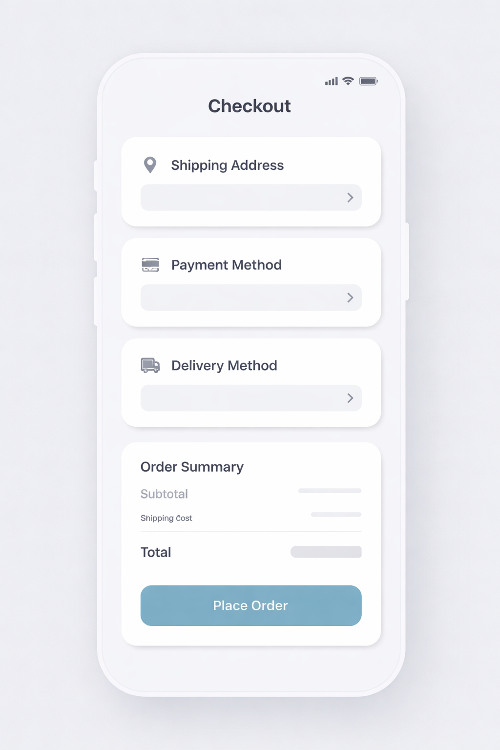
The cookbook describes it for UI mockups as whether "the correct screen type and platform context are present" and "all required sections, states, or constraints are included", failing if anything required is missing "or the output alters the UI's purpose". For marketing work it is the same question in flyer terms: is it recognisably a flyer, and are the headline, subheadline, offer, call to action, footer and hero image all actually there?
Gate 2: is every required word correct?
This is the one OpenAI calls out as "usually the #1 production failure mode", and its criteria are strict. Pass only if all required strings are "present and exactly correct (spelling, punctuation, capitalization, symbols)" and readable, meaning "not smeared, clipped, warped, or overlapping". Fail if any required text is wrong, missing or unreadable, "or any extra text appears".
That final clause is the one designers forget. Invented text is a failure even when it is beautifully set, because somebody downstream has to notice it is nonsense.
The cookbook adds a note that reads like it was written after a bad week: "if your workflow requires 'exact copy,' treat this as a hard gate. Don't average it away."

Sit with that flyer for a second, because it is the most useful image in the whole cookbook. It is competent. The palette is coherent, the icons are consistent, the hierarchy reads. It is also, apart from two words in the top banner, completely empty: blank ribbons where the offer goes, ruled lines where the body copy goes, a blank circle where a price goes. It looks like a flyer the way a stock template looks like a flyer.
A gut check passes that image. A gate does not.
The grades
Once an image is through the gates, OpenAI scores it 0 to 5 on a small number of dimensions. Three of them transfer directly to any design review.
| Dimension | What the cookbook says to look for |
|---|---|
| Layout and hierarchy | "Clear priority: headline dominates, subheadline supports, offer stands out, footer is secondary." Alignment and spacing "feel intentional (no crowded clusters, no random floating elements)". "Read order is unambiguous" |
| Style and brand fit | A consistent palette and typographic feel, "not multiple conflicting styles", and no drift into cartoon illustration when the brief asked for photoreal |
| Visual quality and artifact severity | "No distorted objects, broken hands/cups, melted foam textures, weird artifacts around text." Background texture stays subtle and does not compete with copy |
Notice what the third one does. It separates "this image has a defect" from "this image is ugly", which is the distinction that usually gets lost when a room argues about an AI image. Melted foam is a defect. A palette you dislike is a preference. Score them in different columns and the conversation gets shorter.
For UI work specifically, the cookbook's phrasing for layout is worth quoting because it is a good definition of a good screen generally: the layout "should make primary actions obvious, secondary actions clearly subordinate, and information grouped in a way that reflects real interaction flow".
Editing is graded differently, and more strictly
When you are changing an existing asset rather than making a new one, OpenAI switches the emphasis to what did not change.
For logo edits it grades edit intent correctness, then "non-target invariance", where a 5 means "no detectable changes outside the requested edits" and a 0 means "logo identity compromised", then character and style integrity. For virtual try-on it grades facial similarity, outfit fidelity against the supplied garments, and body shape preservation, where a 5 means "body proportions and pose are preserved" and a 0 means the body "is not recognizable or is fundamentally corrupted".
Translate that into your own review and it becomes a single habit: before you look at whether the change is right, look at everything that was supposed to stay still. Most editing failures are not wrong edits. They are correct edits with collateral damage, and collateral damage is invisible unless you go looking for it.
The review sheet
Pull it together and you have something you can put at the top of a shared file before the next round.
Gates, all must pass
- Is it the deliverable that was briefed, with every required element present?
- Is every required word present, spelled exactly right, legible, and is there no invented text?
- For an edit: is everything outside the requested change untouched?
Grades, 0 to 5 each, only for images that passed
- Layout and hierarchy: does the eye go where it should, in the right order?
- Style and brand fit: one visual language, or several?
- Artifact severity: what breaks when you look at it at full size?
Then tag the failure
The cookbook's advice on iteration is to tag failure modes consistently, so a pile of outputs becomes "what is breaking and how often" rather than a mood. In a studio that means writing "text gate: invented subhead" rather than "not quite there yet", which is the difference between a useful revision brief and another week.
What this does not give you
Rubrics score reliability. They do not confer taste, and OpenAI is honest about that: it reserves a human feedback step for "subjective or ambiguous dimensions ('vibe,' usability clarity, trustworthiness)", with the warning that human judgement drifts unless the rubric stays tight.
So do not mistake a clean scorecard for a good idea. A generated image can pass every gate, score fives across the board and still be a boring picture of a coffee cup. The rubric is there to stop the wrong work reaching the meeting. What happens in the meeting is still your job.
FAQ
Do I need to build the eval harness to use this?
No. The cookbook's code builds a repeatable test suite with model judges, which is useful if you are shipping generated images at volume. The rubric works on its own, on paper, in a review with four people and eight images.
Should I let a model grade my images?
For volume work, OpenAI's whole premise is that multimodal models are practical judges "when paired with tight rubrics, structured outputs, and human calibration". For a single campaign it is overkill. The useful middle ground is to use the rubric yourself and reserve the model judge for regression checks when you change model or prompt.
How does this connect to prompting?
Directly. Every gate has a matching prompt constraint: name the deliverable, quote the exact copy, state what must not change. The prompt patterns are in prompt recipes for gpt-image-2, and this rubric is how you check whether they worked.
Why are the sample images so plain?
Because they are eval fixtures, not portfolio pieces. That is what makes them useful here: they are the kind of output a model actually produces on a reasonable brief, which is exactly the standard your review has to be sharp enough to catch.
Sources
- OpenAI, Image Evals for Image Generation and Editing Use Cases, read 20 September 2026
- openai-cookbook repository, source of the published example images used above
More to read
AI · · 6 min read
Can you use it in client work? What the open image model licences actually say
FLUX and Qwen-Image are free to download and not equally free to use. Which weights are Apache 2.0, which are non-commercial, and the clauses people misread.
AI · · 8 min read
Cutouts with a real alpha channel, generated instead of masked
Background removal clips reeds, sheer ribbon and frosted glass. Generating the alpha channel instead keeps them. Four published workflows, for designers.