


AI · · 8 min read
Cutouts with a real alpha channel, generated instead of masked
Background removal clips reeds, sheer ribbon and frosted glass. Generating the alpha channel instead keeps them. Four published workflows, for designers.
Every designer has lost an hour to the same thing: a beautiful product shot, a background that has to go, and a set of thin reeds or a sheer ribbon that no masking tool handles without leaving a halo. The fix is to stop removing the background and start never having one.
Image models can now return a real alpha channel, and OpenAI has published a full cookbook of workflows built on it: seasonal campaign assets, transparent charts for slide themes, design-template elements and print-on-demand artwork. This is a walkthrough of those four, plus the gotcha that ruins the first attempt for almost everybody.
Everything here comes from OpenAI's transparent image assets cookbook, read on 20 September 2026, and the images are its own published outputs. The prompt-level basics are covered separately in prompt recipes for gpt-image-2; this is the production workflow around them.
The gotcha, first
Here is the sentence to read before you do anything else, quoted from the cookbook: "Prompt instructions take priority over background="transparent". If the prompt describes a backdrop, scene, color, or other background, the model may generate that background instead of producing transparency."
So the parameter is not a guarantee. It is a request that your own prose can override without you noticing. Mention "on a warm ivory surface" anywhere in a prompt and you will get a warm ivory surface, baked in, no matter what the parameter says.
The cookbook's advice is to keep the prompt focused on an isolated subject and ask for transparency explicitly in the words as well as the setting. In practice that means writing your prompt twice: once for what the object is, once for what is not there.
[Subject], full object completely visible and generously padded.
Preserve every natural transparency, refraction, translucent layer and fine
material edge. Output an isolated object on an actual transparent background.
No backdrop, no scene, no surface, no colour wash, no drop shadow, no watermark.
Verify the alpha before you trust it
An image that looks cut out and an image with an alpha channel are different things, and you cannot tell them apart by looking at a white page. The cookbook's check is two lines of logic worth doing however you do it: confirm the file is RGBA, then measure how much of it is fully transparent.
Any image editor will tell you both. Open the file over a mid-grey or a checkerboard, look at the alpha channel directly, and be suspicious of a "transparent" PNG where the fully transparent pixel count is near zero. That is a cutout painted onto an opaque canvas.
Do this once per batch, not once per project. The failure is silent and it propagates.
Workflow 1: one product, every campaign background
The cookbook's first scenario is a fictional home-fragrance brand generating four transparent product shots once and reusing them across spring, summer, autumn and winter storefronts.
The useful part is not the idea, which is old. It is which materials survive. The examples were chosen for their difficult edges: clear and frosted glass, a sheer ribbon on a bottle, the thin reeds and "hairlike pampas fibers" of a diffuser, a fine cotton cord on a candle.
OpenAI's claim about those, stated plainly: "Conventional background-removal tools can clip these details, add halos, or flatten translucent materials. Generating the alpha channel directly helps preserve those subtle edges when the same product is placed on very different backgrounds."
That is the whole argument for this approach, and it is a good one. A cutout algorithm has to guess where a translucent thing ends. A model that generates the alpha has an opinion about transparency from the start.
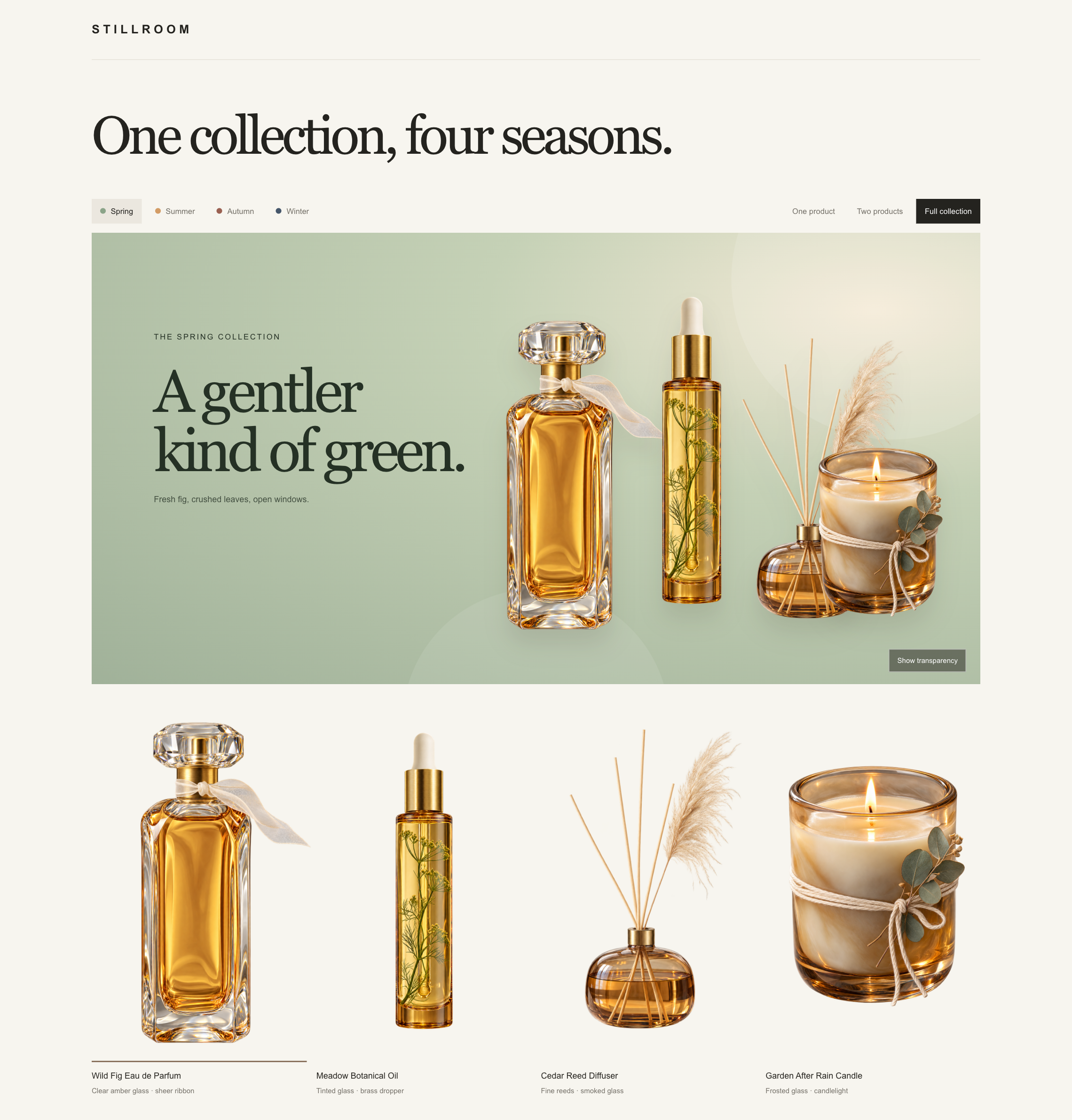
One practical note from the brief: the cookbook generates all four products with a shared paragraph of brand-and-transparency instructions appended to each product description. That is how you keep a collection looking like a collection, and it is the same discipline as writing one lighting setup for a whole shoot.
Workflow 2: charts that sit on the slide template
This one is narrower and more immediately useful than it sounds. Enterprise decks come with a mandated theme, often a gradient or a dark background, and a generated chart with a white box around it looks exactly like what it is.
The cookbook's instruction is more specific than "make the background transparent": ask for transparent areas "across the entire chart, not just outside its silhouette". For a dark theme, it adds white or pale labels, bright brand-compatible colours, and the phrase that does the work: no card, no frame, no panel, no filled plot area.
And then the caution, which you should not skip. The cookbook is explicit that generated chart content "is still raster artwork" and tells you to verify that labels, values and proportions match the source data. For anything where the numbers matter, it recommends rendering the chart deterministically and keeping image generation for illustration.
That is the right line. A generated chart is a picture of data, not a chart. Use it for the concept slide, not the board pack.
Workflow 3: icons, stickers and decorative elements
The design-template scenario is the closest to everyday work: an app icon, a die-cut sticker, a botanical decoration, each as an independent transparent PNG that can be dropped onto any layout.
The prompt pattern is worth memorising because it generalises. Describe the object, then state the boundary and what is outside it:
Create one premium rounded-square app icon with [subject and palette].
Keep everything outside the rounded icon tile transparent.
No text, watermark, shadows, or background.
"Keep everything outside the [shape] transparent" is a much more reliable instruction than "transparent background", because it tells the model where the artwork ends. For a die-cut sticker the cookbook uses the same construction with a "close-fitting cream die-cut border", which is how you get a sticker silhouette instead of a floating illustration.
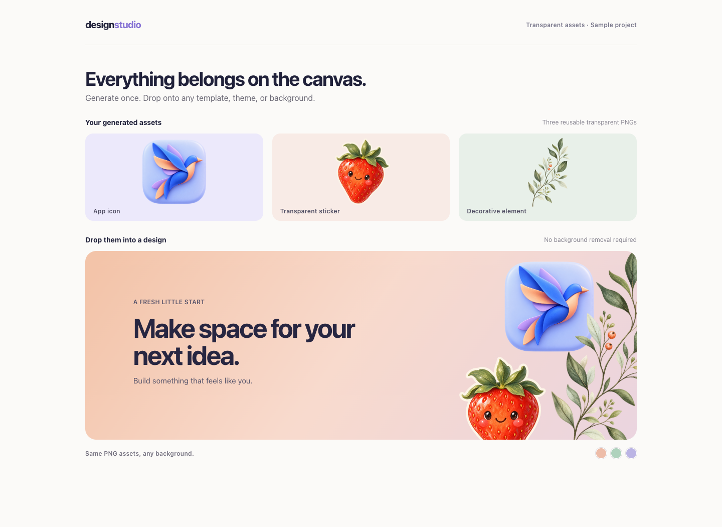
Note "No text, watermark, shadows, or background" appearing in every prompt. Shadows are the one people forget. A drop shadow baked into the alpha is worse than no alpha, because it only looks wrong on the second background you try.
Workflow 4: one artwork, every garment
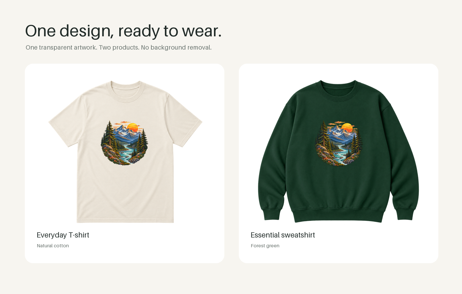
Print-on-demand is the clearest case for this technique. The cookbook generates the print design and the blank garments as separate transparent images, so one illustration can be placed on an ivory T-shirt, a forest-green sweatshirt or whatever the catalogue adds next.
The exclusion list in that prompt is the most instructive one in the cookbook: "No text, bounding badge, white rectangle, garment, or background." Every item there is a thing the model would otherwise helpfully add, and every one of them would weld the artwork to a single product.
The other detail is a production step rather than a prompt: trim the empty transparent margins by cropping to the alpha channel's bounding box before placing the artwork. Generated assets come with generous padding, which you want while generating and do not want when positioning.
Which model, and an honest caveat about these images
The cookbook's setup now names two models, gpt-image-2.5-flare and gpt-image-2.5-sunburst, describing the second as the one to try for demanding quality requirements. It says both support transparent backgrounds, and recommends holding the prompts, sizes and quality="high" constant when you first compare them, then inspecting transparency, fine edges and text before you start tuning for cost or latency.
That comparison method is the useful takeaway, more than the model names, which will change. Change one variable, look at the edges, then optimise.
OpenAI is also unusually straight about its own screenshots, and it is worth repeating: the images in the cookbook are retained from the earlier GPT Image 2 version and illustrate the workflows rather than showing measured results from the newer models. The pictures above are demonstrations of a method, not a benchmark, and nobody should read them as either.
Setting up the file properly
A short checklist, assembled from the cookbook's parameters:
- Ask for PNG output. JPEG cannot hold an alpha channel, so a JPEG "transparent" asset is a contradiction that fails silently.
- Generate at the shape you need. The cookbook's product shots are portrait for a reason: a tall bottle in a square frame is mostly padding.
- Use the high quality setting while you are judging edges. Fine fibres and thin cord are exactly what a cheap pass loses.
- Keep the delivered file as PNG or WebP through every step of your pipeline. One well-meaning JPEG conversion destroys the alpha for everyone downstream.
- Review on at least two backgrounds, one light and one dark. Halos and baked shadows only appear on the second.
FAQ
Is this better than the background remover in my editor?
For hard-edged opaque objects, probably not worth switching. For glass, fabric edges, hair, smoke, fine botanical detail and anything translucent, OpenAI's argument is that generating the alpha avoids the guessing step entirely, and on those materials that is a real difference rather than a marketing one.
Can I use this on a photograph I already have?
The same models accept an existing image as input and can return it with a transparent background, which is the product-extraction case. The cookbook's four workflows generate the subject too, but the transparency instructions are the same either way.
Why did my transparent PNG come back with a checkerboard pattern in it?
Because the model drew one, having seen a great many screenshots where a checkerboard means transparency. Exclude it explicitly in the prompt along with backdrops and shadows.
How do I keep a set of assets looking like a set?
Write the brand and transparency instructions once and append them to each subject description, which is exactly what the cookbook does across its four fragrance products. Consistency of treatment across a set is a prompt-structure problem before it is a model problem, and the broader techniques are in keeping a character and a style consistent.
Sources
- OpenAI, Generate Transparent Image Assets for Campaigns and Presentations, read 20 September 2026
- openai-cookbook repository, source of the published example images used above
More to read
AI · · 7 min read
Which AI image model for which job, going by the makers' own docs
GPT Image, Nano Banana, FLUX.2 and Qwen-Image, compared on what their makers actually document: sizes, editing, text, where they run and what they cost you.
- Tools
Tools · · 8 min read
What your browserslist query is actually targeting
defaults quietly includes Opera Mini and KaiOS, and last 2 versions still includes IE 11. What each query resolves to, and the Baseline queries that replace them.