


Design · · 8 min read
The variable font axes past weight and width, and what they are for
Google Fonts keeps a public registry of every axis it will honour, from Grade to Wonky to Year. Here are the real ranges, and the rule that breaks unlisted axes.
Most designers use variable fonts as a weight slider and stop there. The registry Google Fonts publishes lists more than forty axes, with ranges, defaults and one-line definitions written by the people who decide what the service will serve. Some of them are quietly indispensable, one of them will change how you handle dark mode, and a few are the most fun you can have with type this year.
There is also a hard rule in that document, and it is the reason a font you bought sometimes does nothing when you move its slider: "Axes present in a font file but not in this registry will not function via our API."
Everything below comes from the Google Fonts Axis Registry, read on 22 September 2026, plus the documentation two type families publish about their own axes.
The five you already know, with their real numbers
| Axis | Tag | Range | Default |
|---|---|---|---|
| Weight | wght | 1 to 1000 | 400 |
| Width | wdth | 25 to 300 | 100 |
| Optical Size | opsz | 5 to 1200 | 14 |
| Slant | slnt | -90 to 90 | 0 |
| Italic | ital | 0 to 1 | 0 |
Three things in that table are not what people assume.
Weight runs to 1000, not 900. The named positions stop at Black 900, but the axis keeps going, and a family that draws past it is not doing anything illegal.
Width's named positions run from SuperCondensed at 25 to UltraExpanded at 200, with stops at 62.5, 87.5 and 112.5 along the way, while the axis itself is allowed to run to 300. That is why interpolating "halfway to condensed" in a layout tool rarely lands on a named instance. It is a continuous axis with labels bolted on, not a set of styles.
Slant is signed in the direction that surprises everyone: negative values lean right, which the registry calls an oblique, and positive values lean left, "also called a 'backslanted' or 'reverse oblique' style".
Grade is the axis more designers should be using
Grade, tag GRAD, runs from -1000 to 1000 with a default of 0, and the registry describes it as a way to "finesse the style from lighter to bolder in typographic color, without any changes overall width, line breaks or page layout". The units are the same as weight.
Read that again. It is weight without reflow.
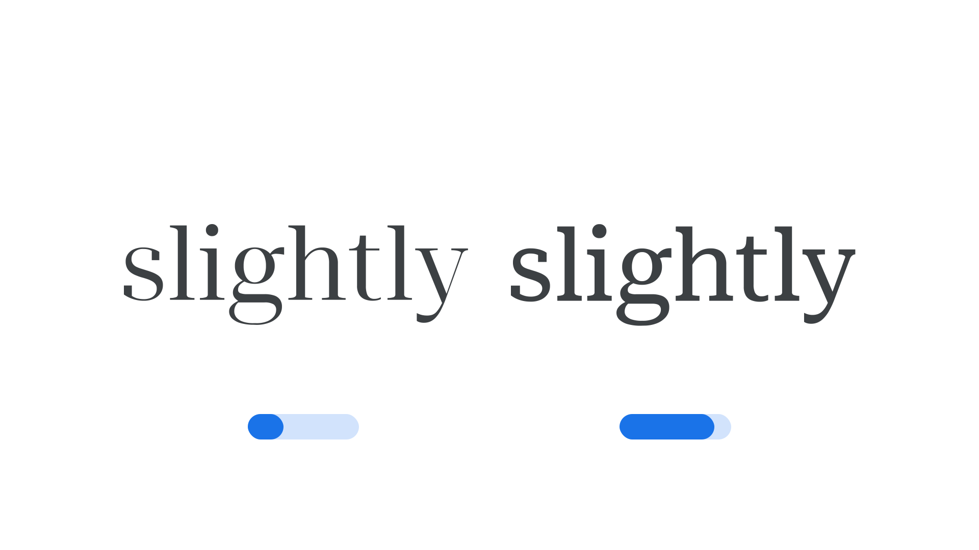
That makes it the correct tool for three jobs most teams solve badly:
- Dark mode. Light type on a dark ground looks heavier than the same type the other way round. Dropping the grade a little compensates without changing a single line break.
- Hover and press states. Thickening a label on hover with weight makes the layout twitch. Grade does not move anything.
- Print versus screen, or low-quality screens. Nudge the grade rather than re-specifying the whole type scale.
Roboto Flex is the obvious family to try it on: its variable file exposes GRAD alongside opsz, slnt, wdth, wght and a set of parametric axes including XOPQ, XTRA, YOPQ and several vertical metrics. Its repository is candid that the project "was commissioned by Google, but is not an official Google project", and the fonts are under the SIL Open Font License.
The expressive axes, and what each one actually moves
These are the ones worth knowing exist, because the right one turns a competent typographic choice into a voice.
| Axis | Tag | Range | What it does, per the registry |
|---|---|---|---|
| Casual | CASL | 0 to 1 | Moves "from a sturdy, rational Linear style to a friendly, energetic Casual style" by changing stroke curvature, contrast and terminals |
| Softness | SOFT | 0 to 100 | Letterforms "become more and more soft and rounded" |
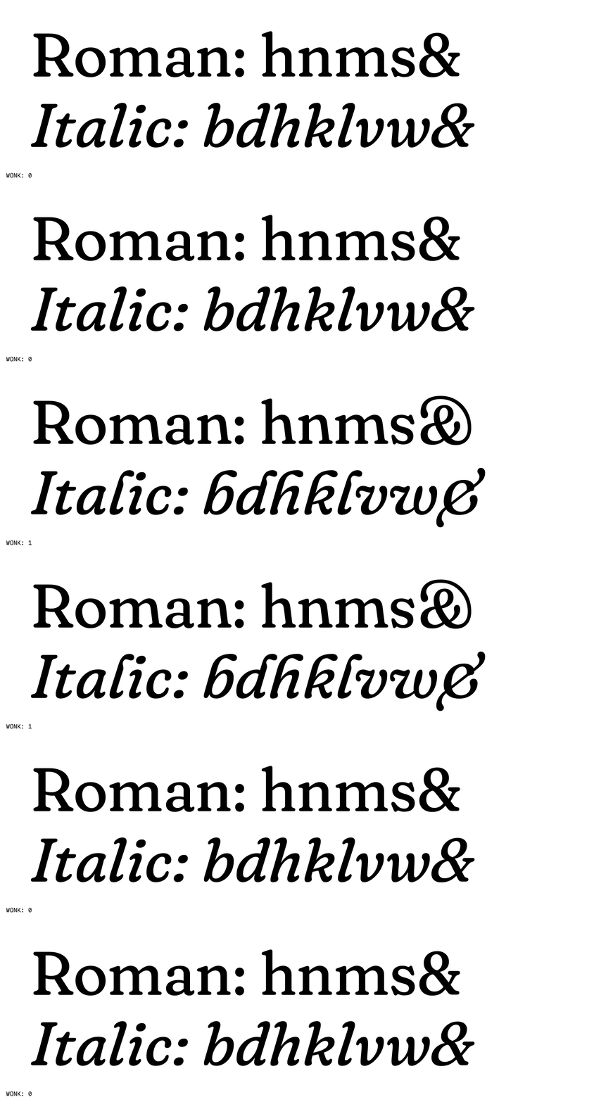
| Wonky | WONK | 0 to 1 | Substitutes wonky forms, "such as leaning stems in roman, or flagged ascenders in italic" |
| Contrast | CTRS | -100 to 100 | Thick-to-thin difference. Negative values give reverse contrast, "a 19th-century, 'circus' or 'old West' effect" |
| Bounce | BNCE | -100 to 100 | Shifts glyphs up and down, "resulting in an uneven, bouncy baseline" |
| Jitter | JITT | 0 to 100 | "Higher values emulate the mechanical imperfection and displacement of vintage printers" |
| Roundness | ROND | 0 to 100 | Angular defaults to increasingly rounded |
| Sharpness | SHRP | 0 to 100 | Blunt defaults to increasingly sharpened |
| Informality | INFM | 0 to 100 | "Formal and traditional" to "informal and unconventional" |
| Monospace | MONO | 0 to 1 | Proportional widths to fixed widths, in the same family |
| Fill | FILL | 0 to 1 | Fills transparent forms with opaque ones, meant for state transitions |
| Cursive | CRSV | 0 to 1 | Off, auto at 0.5, or forced cursive substitution at 1 |
| Year | YEAR | -4000 to 4000 | "Shows in a metaphoric way the effect of time on a chosen topic" |
Year deserves a moment. Default 2000, range four thousand years either side. It is not a joke axis, it is an admission that an axis can encode any continuous idea a type designer can draw, and the registry will carry it. If you have ever wanted type that ages, the slot exists.
Contrast deserves a second moment, because reverse contrast is the single quickest way to make a display setting look deliberate rather than defaulted. Thin where you expect thick. It reads as Western, as circus poster, as 1970s reissue, and at small negative values it just reads as odd in a way people cannot place.
What the type designers say about using them
The registry defines the axes. The families that implement them give better advice, and it is worth taking.
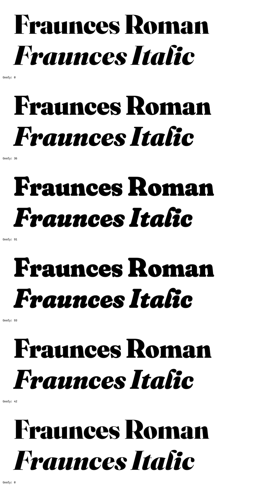
Fraunces exposes SOFT and WONK next to weight and optical size. Its documentation explains that the wonky forms are tied to size: the axis "automatically substitutes when opsz > 18", so the leaning stems and flagged ascenders appear at display sizes and step aside for reading sizes. That is the correct relationship between expression and function, built into the font rather than left to you.
Recursive, which implements MONO, CASL, CRSV and a slant running 0 to -15, publishes the most useful warning of all. Its documentation says the Casual and Slant axes "look great with intermediate values at text sizes, but they are mostly intended to be used at either fully 'on or off' values, with intermediates available to allow animated stylistic transitions. If you are setting type at large sizes, avoid intermediate CASL and slnt values."
That is a general rule with a specific author behind it. Continuous does not mean every position is drawn to be looked at closely. Intermediate positions exist so the transition is smooth; the ends exist because someone designed them.
Recursive also notes that its MONO and CASL axes are "unregistered" in Microsoft's official listing, so the tags must be written in capitals. That capitalisation convention is not decoration: lowercase tags are the five registered OpenType axes, uppercase tags are everything else.
The rule that decides whether any of this works
Two lines from the registry are the practical takeaway.
The first: "Axes present in a font file but not in this registry will not function via our API." A foundry can put any axis in a file. Whether a delivery service honours it is a separate question, and Google Fonts answers it with this list.
The second: the repository is upstream of the live product, so "axis definitions are only final when they appear on that page", meaning fonts.google.com/variablefonts. This repository can carry axes that are not live yet. If you are specifying something exotic for a client, check the live page, not the source of truth's source of truth.
The registry also explains why it exists at all. Google Fonts supports "a superset of the OpenType axis registry axis set", because Microsoft's effort to extend the official list, opened in 2016, "had stalled" by August 2020. So this is a de facto standard filling a gap, maintained by the largest font distributor on the web, and it openly hopes other foundries will publish the same thing.
FAQ
How do I know which axes a font actually has?
The font tells you, not the registry: "No variable font is expected to support all of the axes here." Open it in your design tool's variable font panel, or read the family's own documentation, which in the better projects lists every axis with its range and default.
Why does my slider do nothing?
Three usual causes. The axis is not in the font. The axis is in the font but not in the registry, so a hosted delivery service strips it. Or the axis is binary, like WONK and ital, and only 0 and 1 mean anything.
Should I use arbitrary axis positions or named instances?
Named instances for anything a client will maintain, because they survive a handoff. Arbitrary positions for one-off display work where you are art directing a specific setting. The registry's fallback positions exist exactly so legacy environments get a sensible static cut.
Is a bouncy baseline ever a good idea?
Yes, in a logotype, a packaging lockup, a children's title sequence, anywhere the type is the picture. In running text it is vandalism. BNCE and JITT are the two axes most likely to be used badly, and that is not the registry's fault.
Sources
- Google Fonts Axis Registry, read 22 September 2026, source of the tags, ranges, defaults, descriptions and the API rule
- Axis definitions in the registry data directory, source of the individual axis metadata quoted above
- Fraunces, Undercase Type, source of the SOFT and WONK axis documentation and the animations above
- Recursive, Arrow Type, source of the axis usage advice and the note on unregistered tags
- Roboto Flex, source of the parametric axis list and the licence note
More to read

AI · · 8 min read
Z-Image runs on a 16GB card. Turbo is the variant to be careful with
Tongyi-MAI's 6B open model ships in four variants. Its own table rates Turbo's quality Very High and its diversity Low, and that trade decides which you want.
Design · · 7 min read
Telling an image model where to put things
You cannot hand an image model coordinates. You can give it a deliverable, a viewpoint, a placement list and a canvas, and those four do most of the work.