


Design · · 7 min read
Why it reads as AI, and the prompt words that cause it
The tell is rarely a sixth finger. It is polish: even light, immaculate surfaces, a centred subject and a warm grade. Here is what causes each one.
The giveaway in most AI images is not anatomy. It is finish. Everything in the frame has been given the same loving treatment: the light is even, every surface is new, the subject sits in the middle with a tasteful blur behind it, and the colour has been pushed a quarter stop warm. Real photographs are uneven. Something is always slightly wrong in them, and that wrongness is what makes them read as true.
The useful part is that the polish is mostly coming from your prompt, and the model makers say so in their own guides. OpenAI's prompting guide tells you to "prompt the model as if a real photo is being captured in the moment", to ask explicitly for "real texture (pores, wrinkles, fabric wear, imperfections)", and to "avoid words that imply studio polish or staging". Those three lines are a diagnosis as much as advice.
The four defaults to fight
Light
The default is soft, sourceless and flattering. No hard edge on the shadow, no blown highlight, no colour cast from the wall the subject is standing next to, no lens flare that landed where you did not want it. Real interiors are lit by one dominant source and a lot of bounce, and they have dark corners.
Ask for a named light: overcast noon, a single window at three quarters, hard midday sun with black shadows, mixed daylight and sodium street light at dusk. Then ask for the consequence, which is the part that sells it: deep shadow under the chin, blown sky through the window, colour spilling onto the skin from a red wall.
Surface
Everything in a generated image tends to be new. Clean cotton, unscuffed shoes, fresh paint, unfingerprinted glass, teeth that have never met coffee. Ask for age and wear by name: faded print, pilled knit, chipped varnish, sweat marks, dust on the shelf edge, a repair that was done badly.
Composition
The subject lands in the middle, the horizon lands in the middle, and the background falls away into pleasant bokeh. Real reportage is full of accidents: someone cropped at the edge, a pole growing out of a head, too much floor, a subject pushed into the corner because that is where they were standing. Ask for the frame you want, including the awkward version.
Colour
Left alone, models grade warm, contrasty and saturated, which is the visual accent of a stock library. Name the palette and the film instead: muted and cool, low contrast, faded blacks, a slight green cast, colour that looks like it came off a cheap scan.
The same model, two registers
Both of these are OpenAI's own published outputs, from the same guide, made with the same model. They are not a test, they are the maker's showcase, and that is exactly what makes the comparison useful: the difference between them is the prompt.
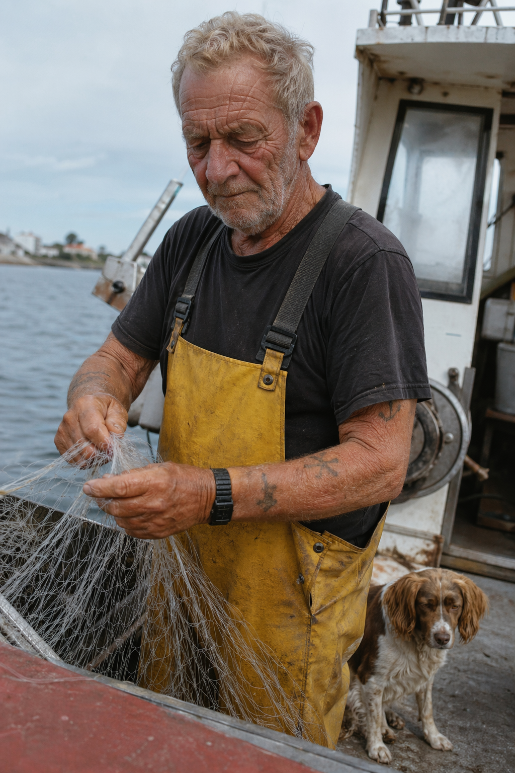
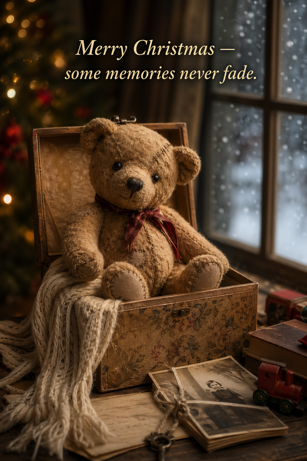
The fisherman works because the prompt asked for flat coastal daylight, real skin texture and no heavy retouching. The light is grey and uninteresting in the way real weather is. The apron is dirty. The dog is slightly out of focus and looks bored.
The card works too, but it is the polished register: every highlight is warm, every edge is soft, the background is a wall of bokeh. Nothing is wrong with that picture. It is a Christmas card, and Christmas cards are supposed to look like that. The point is that the register was chosen, and if you do not choose one, you get this one by default.
The words that push and the words that pull
This table is a craft judgement rather than a measured result. It follows the way the makers word their own examples, and the right-hand column is the language their photorealism guidance uses.
| Words that push towards the generic look | Words that pull towards a real photograph |
|---|---|
| cinematic, epic, dramatic lighting | overcast, hard midday sun, single window, mixed light |
| 8K, ultra detailed, hyperrealistic, masterpiece | photorealistic, real photograph, everyday detail |
| professional studio shot, perfect, flawless | unposed, candid, uncorrected, no retouching |
| beautiful, stunning, breathtaking | specific nouns: chipped, faded, damp, creased |
| bokeh, glow, magical, ethereal | deep focus, visible grain, dull colour, flat contrast |
| trending, award winning, high end | the actual job: press photograph, catalogue shot, ID photo |
Two notes on the right-hand column, both from OpenAI's guide. The word "photorealistic" is worth including literally, because it "strongly engages the model's photorealistic mode". And camera specifications are a mood setting, not a simulation: the guide warns that "detailed camera specs may be interpreted loosely, so use them mainly for high-level look and composition rather than exact physical simulation". Asking for a 35mm lens at f/1.4 gets you the feeling of that picture, not its optics.
The rewrite trap
Several models now expand your prompt before they draw. Tencent lists prompt self-rewrite as a feature of HunyuanImage-3.0-Instruct, which "automatically enhances sparse or vague prompts into professional-grade, detail-rich descriptions". Google warns the other way around, that Imagen "is trained on long captions" and that short prompts "may result in low adherence and a more random output".
Both statements point at the same thing. Whatever you leave unspecified, something else decides, and what it decides is the average of everything it has seen. That average is precisely the look you are trying to avoid. A one-line prompt is a request for a stock image.
When the polish is right
Half the work a designer does wants the polished register, and pretending otherwise is posturing. Beauty and skincare, luxury packaging, festive retail, food, product hero shots, the opening slide of a pitch deck: these are all meant to look immaculate, because the product is the promise.
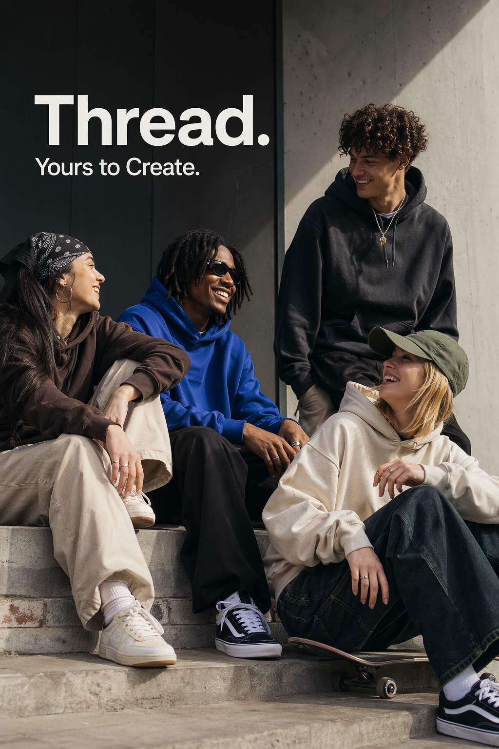
Look at that image as a client would. The type is well set, the palette is disciplined, the light is genuinely hard and directional, the poses are relaxed. And every single garment is factory fresh, nobody has a wrinkle, and the group reads as cast rather than found. For a brand campaign, that is correct. For a documentary series about the same neighbourhood, it would be a disaster.
The skill is knowing which register the job wants, then asking for it on purpose. OpenAI's own advice for ads is to write the prompt like a creative brief and let the model make taste decisions inside your boundaries, which works exactly as well as your boundaries are drawn.
Five things to check before you send it
- Where is the light coming from? If you cannot point at it, neither can the viewer, and that is the first thing that reads as fake.
- What in this picture is old, dirty or broken? If nothing is, add something.
- Is the subject centred? Ask whether you chose that or the model did.
- Is every texture rendered at the same level of detail? Real lenses fall off. Generated images tend not to.
- Would a photographer have taken this frame? Not could they, would they. Real pictures are taken from where the photographer could actually stand.
If you want a harder-edged review process for the same problem, the grading rubric OpenAI publishes for its own image evaluations makes a good checklist, and it is unpacked in a scoring sheet for AI images. The prompt structures behind the examples here are in prompt recipes for gpt-image-2.
FAQ
Is there a single prompt that removes the AI look?
No, and anyone selling one is selling a preset. The look comes from unspecified decisions, so the fix is specificity: a named light source, named materials, a named condition for those materials, and a frame you chose.
Do negative prompts help?
They help when they name a concrete thing to avoid, which is why OpenAI's own examples include lines like avoiding cinematic lighting, dramatic colour grading or stylised composition, and, in a slide prompt, avoiding clip art, stock photography, gradients and decoration. Vague negatives such as "not ugly" do nothing.
Will higher resolution make it look more real?
No. It makes the same aesthetic bigger. Resolution decides how much you can crop and print, not whether the image reads as a photograph.
My client likes the polished version. Now what?
Then ship it, and be deliberate. The argument for texture is not that grit is better, it is that undifferentiated polish is invisible. If the brand's whole category looks immaculate, the differentiated choice might be the flat, plain, slightly awkward picture.
Sources
- OpenAI, GPT Image Generation Models Prompting Guide, read 21 September 2026
- openai-cookbook repository, source of the published example images above
- Tencent, HunyuanImage-3.0 repository, read 21 September 2026
- Google, Get started with image generation, REST API quickstart, read 21 September 2026
More to read
Design · · 6 min read
The sizes AI image models can actually give you, and how to art direct around them
Every model has hard ceilings on size and shape. The real numbers for Nano Banana and gpt-image-2, and what they mean for print, social and billboards.
- AI
AI · · 6 min read
An image model that hands you layers instead of a flat PNG
Qwen-Image-Layered splits a picture into separate RGBA layers you can move, recolour and export as a PSD. What it does, and the thing it does not do.